For many, the artwork on the front of an album is taken as the "first impression" for the record, or for the band as a whole. The artists commissioned to design album artwork are certainly aware of this, as are the bands that put their names on the cover. The artwork should, ideally, represent the emotions contained within an album, as well as give an opportunity for the audience to expand on their feelings for the music. So, the artwork is usually the only visual representation for the entire album.
Green Day are considered by many (especially by us avid fans) to be a band that puts a higher-than-normal level of emotion into each and every song they release. After all, that's why we listen to them, isn't it?! We enjoy the fact that Green Day doesn't take any song or album lightly. In one of the mini-interviews on Bullet In A Bible, Billie talks about the thrill he gets when he sees the emotion that he puts into each song being reflected back at him by the audience at live performances. Since emotion is such a big deal to the band, I'd like to talk a little bit about each of Green Day's album covers, and what they mean with respect to the albums they symbolize.
1,039/Smoothed Out Slappy Hours:
 Green Day's first full-length release was, obviously, produced and coordinated on a very limited budget. Therefore, the album artwork isn't much, compared to the band's later albums. 1,039/Smoothed Out Slappy Hours takes it's cover art from Green Day's 1990 release, 39/Smooth. The cover art and photo were contributed by Jesse Michaels (of Operation Ivy), and Susie Grant. The cover photo depicts a girl (who looks fairly creepy, I might add) standing in a cemetery. Since most of the album contains indirect, blurry, and varying song topics, the eerie cover art seems to fit well.
Kerplunk:
 Kerplunk, to the casual listener, may sound very similar as a whole to the first Green Day album, because it was recorded at the same studio as 1,039/Smoothed Out Slappy Hours, only two years later. The structures of the songs themselves bear quite a bit of resemblance as well: rolling drum and bass parts, extremely catchy vocal harmonies, and punchy guitar riffs. According to Kerplunk's liner notes, the men responsible for contributing to the design of the cover were Chris Applecore, and Pat Hynes. This art is, without a doubt, one of my all-time favorite Green Day album covers. The girl on the cover is smiling contently, and holding a smoking pistol...I bet she wasn't up to anything even remotely illegal, right?...
Dookie:
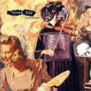
 Dookie was Green Day's breakout record, opening the doors to bigger tours, higher salaries, and...GASP!...A MAJOR RECORD LABEL! Therefore, a way cooler, more kick-ass album cover was in store. Designed by Richie Bucher, the art is made up of many individual characters and illustrations, all contributing to the mass chaos being depicted. Here's a cool description that Billie Joe gave of the album cover:
Insomniac:
 After what was almost surely the most stressful time the guys had ever endured (the Dookie tour), they started work on what they themselves called a "darker album." Then, in 1995, out came Insomniac. And, as we well know, the guys in Green Day don't disappoint. So, they hired the very well-known pop artist, Winston Smith. The piece that would later become the cover of Insomniac was titled "God Told Me To Skin You Alive," which definitely fits with the dark theme. Here's an excerpt from an interview with Smith:
This was actually just a part of the whole interview, which is really cool. Smith even reveals that the guys told him they were considering the title "Tightwad Hill" for the album. If you'd like to read the other few paragraphs about Smith's creation of the Insomniac cover, check out his official site.
Nimrod:
 The year 1997 brought Green Day's fifth full-length release, Nimrod. The theme in this album isn't necessarily darkness, but there does seem to be an emphasis on angst for many different aspects of normal life. Songs like "Worry Rock," "Uptight," "The Grouch," and "Nice Guys Finish Last" all display Billie's underlying frustration. When most of us were younger, and had decided we were fed up with our peers or a specific person we knew, what did we do? We broke out our yearbooks, and started scribbling out faces, drawing devil horns, adding vicious labels, things like that. This happens to be exactly what Green Day decided to emblazon on the album cover for Nimrod. Two rather nerdy-looking guys have their faces covered by a circle containing the word "nimrod." The cover design is credited to Chris Bilheimer. This is definitely one of my favorite pieces of Green Day album artwork.
Warning:
 Warning is often called Green Day's "experimental" album. Almost every song incorporates acoustic guitars, and the band's composition style was drastically different. This has lured me, along with many other Green Day fans, to call Warning our favorite album. Though the music within the record is refreshingly different and interesting, the album cover itself doesn't stand out, by any means. The photo on the front features the guys, looking especially somber, walking down a city street. Interpret this however you like, but it's nothing too special! Marina Chavez and Chris Bilheimer were in charge of the photography. Normal cover, but a very above-average album!
Shenanigans:
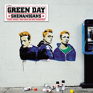 It's time for a confession: I wasn't going to include Shenanigans in this list, because it isn't a studio album. But, this cover artwork happens to be a favorite of our very own Andres Martinez, so who would I be to not include it?! Although Shenanigans is technically a compilation album, I really do love it. The collection of B-sides, rarities, and covers is really fun to listen to, and I'm glad the band put them all in one place for us. Shenanigans was released in 2002, and its cover initially caused some confusion among retailers. Whether you've ever noticed it or not, Green Day's logo is nowhere on the cover! The band did use the Shenanigans-style green "spray paint" logo (that most of us would recognize) for promotional purposes, but it wasn't featured in Chris Bilheimer's artwork for the cover. As a result, a sticker had to be put on the front of the Shenanigans CDs so that people could tell whose music they were buying!
American Idiot:
 Well, here it is. American Idiot. The album that captivated a generation, and brought flocks of new fans to the beam of musical light that is Green Day. American Idiot was the first album I ever bought, and will probably always remain one of my all-time favorites. Once the album was released, it was no secret to the listeners that Green Day wanted to make a political statement, which they certainly did. Billie Joe insists that the album's theme wasn't solely political, which is absolutely true. The listener is taken on a journey, and introduced to the life and times of characters such as the Jesus of Suburbia, Saint Jimmy, and Whatsername. The band certainly needed to make a statement with the album cover, so again they turned to the man who seems to be their go-to cover artist: Chris Bilheimer. Bilheimer came up with an iconic design for the cover, which was taken directly from one of the album's most powerful tracks: "She's A Rebel," with the lyric "And she's holdin' on my heart like a hand grenade." This was brilliantly converted into graphics, and placed directly on the cover of what is now widely considered to be one of the greatest punk rock albums ever released.
21st Century Breakdown:
 When Green Day released the long-awaited follow-up to American Idiot, the fans saw that the band had decided on another concept album/rock opera, whatever you'd like to call it. Even though it hasn't been converted to a musical like it's 2004 predecessor has been, I definitely think that 21st Century Breakdown was Green Day's most theatrical and complex album. With a whopping 18 songs, the album definitely doesn't disappoint. The plot follows the fictional characters Christian and Gloria through a post-Bush world. They try to find out where they belong, while also maintaining their independence. The bond between these two is clearly illustrated by the passionate embrace shown on the cover. While you can see the finished version that Chris Bilheimer designed to the right, here's an interesting image that seems to show the progression of the artwork used on 21st Century Breakdown.
¡Uno!, ¡Dos!, and ¡Tré!:
[img=070512_unodostre.jpg]FINALLY! If you're like me, you've been dying to know what the album covers for Green Day's new trilogy, ¡Uno!, ¡Dos!, and ¡Tre! will look like. Last month, Green Day released the trailer for their first new release, ¡Uno!, which will be out on September 25. As well as showing us more of the band putting the final touches on the albums, the trailer also revealed the artwork for the first of the three albums. From the studio video snippets and the secret show tunes, we've learned that the songs Green Day's tenth studio release will be happy-go-lucky and somewhat random ("Rusty James"....?), yet powerful and just as punk as ever. With the band returning to their pop-punk roots, light and amusing album artwork like what's on the three albums seems extremely fitting. On ¡Uno!, Billie is seen with a joking smile, and pink Xs over his eyes. On ¡Dos!, Mike's face looks like he's been caught off guard by the camera! And on ¡Tré!, the great human being that is Tre Cool looks like he's about ready to take over the world. Then again.....when DOESN'T Tre look like that?! For all the latest info about the trilogy, be sure to check out this page.
Well, we've completed our trip back through Green Day's releases, and the artwork that symbolizes them. I had a blast writing this, as I hope you did reading it! You guys can find me on twitter, @jack__yates. Next time you're listening to your favorite Green Day album, take a second to check out the cover...you may find something you hadn't ever noticed there before!
Green Day are considered by many (especially by us avid fans) to be a band that puts a higher-than-normal level of emotion into each and every song they release. After all, that's why we listen to them, isn't it?! We enjoy the fact that Green Day doesn't take any song or album lightly. In one of the mini-interviews on Bullet In A Bible, Billie talks about the thrill he gets when he sees the emotion that he puts into each song being reflected back at him by the audience at live performances. Since emotion is such a big deal to the band, I'd like to talk a little bit about each of Green Day's album covers, and what they mean with respect to the albums they symbolize.
1,039/Smoothed Out Slappy Hours:
Green Day's first full-length release was, obviously, produced and coordinated on a very limited budget. Therefore, the album artwork isn't much, compared to the band's later albums. 1,039/Smoothed Out Slappy Hours takes it's cover art from Green Day's 1990 release, 39/Smooth. The cover art and photo were contributed by Jesse Michaels (of Operation Ivy), and Susie Grant. The cover photo depicts a girl (who looks fairly creepy, I might add) standing in a cemetery. Since most of the album contains indirect, blurry, and varying song topics, the eerie cover art seems to fit well.Kerplunk:
Kerplunk, to the casual listener, may sound very similar as a whole to the first Green Day album, because it was recorded at the same studio as 1,039/Smoothed Out Slappy Hours, only two years later. The structures of the songs themselves bear quite a bit of resemblance as well: rolling drum and bass parts, extremely catchy vocal harmonies, and punchy guitar riffs. According to Kerplunk's liner notes, the men responsible for contributing to the design of the cover were Chris Applecore, and Pat Hynes. This art is, without a doubt, one of my all-time favorite Green Day album covers. The girl on the cover is smiling contently, and holding a smoking pistol...I bet she wasn't up to anything even remotely illegal, right?...Dookie:
Dookie was Green Day's breakout record, opening the doors to bigger tours, higher salaries, and...GASP!...A MAJOR RECORD LABEL! Therefore, a way cooler, more kick-ass album cover was in store. Designed by Richie Bucher, the art is made up of many individual characters and illustrations, all contributing to the mass chaos being depicted. Here's a cool description that Billie Joe gave of the album cover:I wanted the art work to look really different. I wanted it to represent the East Bay and where we come from, because there's a lot of artists in the East Bay scene that are just as important as the music. So we talked to Richie Bucher. He did a 7-inch cover for this band called Raooul that I really liked. He's also been playing in bands in the East Bay for years. There's pieces of us buried on the album cover. There's one guy with his camera up in the air taking a picture with a beard. He took pictures of bands every weekend at Gilman's. The robed character that looks like the Mona Lisa is the woman on the cover of the first Black Sabbath album. Angus Young is in there somewhere too. The graffiti reading "Twisted Dog Sisters" refers to these two girls from Berkeley. I think the guy saying "The fritter, fat boy" was a reference to a local cop.
Insomniac:
After what was almost surely the most stressful time the guys had ever endured (the Dookie tour), they started work on what they themselves called a "darker album." Then, in 1995, out came Insomniac. And, as we well know, the guys in Green Day don't disappoint. So, they hired the very well-known pop artist, Winston Smith. The piece that would later become the cover of Insomniac was titled "God Told Me To Skin You Alive," which definitely fits with the dark theme. Here's an excerpt from an interview with Smith:I met Tre when he lived up in NorthÂern CalÂiÂforÂnia. One day a couÂple years later, he gave me a call and asked if I'd do a record cover for the band he was in, Green Day. WithÂout knowÂing anyÂthing much about them I said, 'Sure.' And the next thing I knew, Tre and BilÂlie Joe -- I think Mike was out of town that day -- were sitÂting in my stuÂdio pourÂing over phoÂtoÂcopies of almost everyÂthing I'd ever creÂated. The image that grabbed them the most was the pair of figÂures approÂpriÂated from Jan van Eyck's 'WedÂding PorÂtrait of 1434′, in the picÂture 'Til Death Do Us Part' (page 17 of his book 'ArtÂcrime'), so I used that as the nucleus for my composition.
This was actually just a part of the whole interview, which is really cool. Smith even reveals that the guys told him they were considering the title "Tightwad Hill" for the album. If you'd like to read the other few paragraphs about Smith's creation of the Insomniac cover, check out his official site.
Nimrod:
The year 1997 brought Green Day's fifth full-length release, Nimrod. The theme in this album isn't necessarily darkness, but there does seem to be an emphasis on angst for many different aspects of normal life. Songs like "Worry Rock," "Uptight," "The Grouch," and "Nice Guys Finish Last" all display Billie's underlying frustration. When most of us were younger, and had decided we were fed up with our peers or a specific person we knew, what did we do? We broke out our yearbooks, and started scribbling out faces, drawing devil horns, adding vicious labels, things like that. This happens to be exactly what Green Day decided to emblazon on the album cover for Nimrod. Two rather nerdy-looking guys have their faces covered by a circle containing the word "nimrod." The cover design is credited to Chris Bilheimer. This is definitely one of my favorite pieces of Green Day album artwork.Warning:
Warning is often called Green Day's "experimental" album. Almost every song incorporates acoustic guitars, and the band's composition style was drastically different. This has lured me, along with many other Green Day fans, to call Warning our favorite album. Though the music within the record is refreshingly different and interesting, the album cover itself doesn't stand out, by any means. The photo on the front features the guys, looking especially somber, walking down a city street. Interpret this however you like, but it's nothing too special! Marina Chavez and Chris Bilheimer were in charge of the photography. Normal cover, but a very above-average album!Shenanigans:
It's time for a confession: I wasn't going to include Shenanigans in this list, because it isn't a studio album. But, this cover artwork happens to be a favorite of our very own Andres Martinez, so who would I be to not include it?! Although Shenanigans is technically a compilation album, I really do love it. The collection of B-sides, rarities, and covers is really fun to listen to, and I'm glad the band put them all in one place for us. Shenanigans was released in 2002, and its cover initially caused some confusion among retailers. Whether you've ever noticed it or not, Green Day's logo is nowhere on the cover! The band did use the Shenanigans-style green "spray paint" logo (that most of us would recognize) for promotional purposes, but it wasn't featured in Chris Bilheimer's artwork for the cover. As a result, a sticker had to be put on the front of the Shenanigans CDs so that people could tell whose music they were buying!American Idiot:
Well, here it is. American Idiot. The album that captivated a generation, and brought flocks of new fans to the beam of musical light that is Green Day. American Idiot was the first album I ever bought, and will probably always remain one of my all-time favorites. Once the album was released, it was no secret to the listeners that Green Day wanted to make a political statement, which they certainly did. Billie Joe insists that the album's theme wasn't solely political, which is absolutely true. The listener is taken on a journey, and introduced to the life and times of characters such as the Jesus of Suburbia, Saint Jimmy, and Whatsername. The band certainly needed to make a statement with the album cover, so again they turned to the man who seems to be their go-to cover artist: Chris Bilheimer. Bilheimer came up with an iconic design for the cover, which was taken directly from one of the album's most powerful tracks: "She's A Rebel," with the lyric "And she's holdin' on my heart like a hand grenade." This was brilliantly converted into graphics, and placed directly on the cover of what is now widely considered to be one of the greatest punk rock albums ever released.21st Century Breakdown:
When Green Day released the long-awaited follow-up to American Idiot, the fans saw that the band had decided on another concept album/rock opera, whatever you'd like to call it. Even though it hasn't been converted to a musical like it's 2004 predecessor has been, I definitely think that 21st Century Breakdown was Green Day's most theatrical and complex album. With a whopping 18 songs, the album definitely doesn't disappoint. The plot follows the fictional characters Christian and Gloria through a post-Bush world. They try to find out where they belong, while also maintaining their independence. The bond between these two is clearly illustrated by the passionate embrace shown on the cover. While you can see the finished version that Chris Bilheimer designed to the right, here's an interesting image that seems to show the progression of the artwork used on 21st Century Breakdown.
¡Uno!, ¡Dos!, and ¡Tré!:
[img=070512_unodostre.jpg]FINALLY! If you're like me, you've been dying to know what the album covers for Green Day's new trilogy, ¡Uno!, ¡Dos!, and ¡Tre! will look like. Last month, Green Day released the trailer for their first new release, ¡Uno!, which will be out on September 25. As well as showing us more of the band putting the final touches on the albums, the trailer also revealed the artwork for the first of the three albums. From the studio video snippets and the secret show tunes, we've learned that the songs Green Day's tenth studio release will be happy-go-lucky and somewhat random ("Rusty James"....?), yet powerful and just as punk as ever. With the band returning to their pop-punk roots, light and amusing album artwork like what's on the three albums seems extremely fitting. On ¡Uno!, Billie is seen with a joking smile, and pink Xs over his eyes. On ¡Dos!, Mike's face looks like he's been caught off guard by the camera! And on ¡Tré!, the great human being that is Tre Cool looks like he's about ready to take over the world. Then again.....when DOESN'T Tre look like that?! For all the latest info about the trilogy, be sure to check out this page.
Well, we've completed our trip back through Green Day's releases, and the artwork that symbolizes them. I had a blast writing this, as I hope you did reading it! You guys can find me on twitter, @jack__yates. Next time you're listening to your favorite Green Day album, take a second to check out the cover...you may find something you hadn't ever noticed there before!